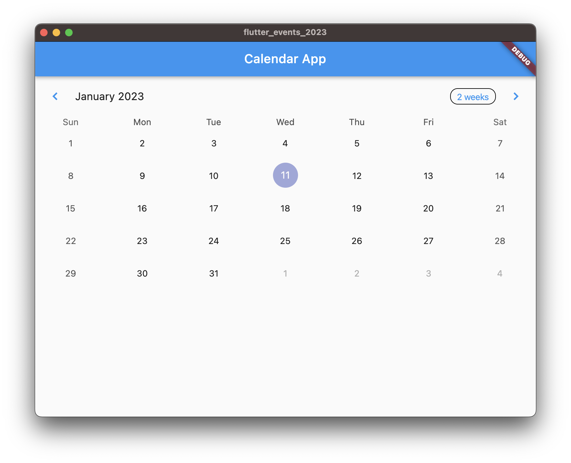
Calendar is integral to various types of applications. From a simple scheduling application to complex management systems, calendar plays important role. In this tutorial we will learn to display and customize a calendar in our Flutter application.
Table Calendar
We will be using table_calendar an easy to use yet highly customizable calendar available in pub.dev. We will learn to install and use this package to display and customize calendar widget in our Flutter application. Let’s get started.
Displaying Calendar
Add table calendar dependency in your
pubspec.yamlfiledependencies:
table_calendar: <latest>import
import 'package:table_calendar/table_calendar.dart';Define three required variables
focusedDay,firstDay,lastDaylate DateTime _focusedDay;
late DateTime _firstDay;
late DateTime _lastDay;In
initStateInitialize those variables_focusedDay = DateTime.now();
_firstDay = DateTime.now().subtract(const Duration(days: 1000));
_lastDay = DateTime.now().add(const Duration(days: 1000));On the body add table calendar with these required params
TableCalendar(
  focusedDay: _focusedDay,
  firstDay: _firstDay,
  lastDay: _lastDay,
),
The
_focusedDayis the currently focused day, so it makes sense to make it current date.The
_firstDayis how many days in past does calendar display and allow to select date.The
_lastDayis how many days is future does the calendar display and allow to select date.Depending on your use case you can set custom date for all these three variables. Remember calendar will not show date previous to
_firstDayand next to_lastDay.Run and you can see the calendar

Interactivity
If right now you switch to next month of the calendar and do hot reload, the calendar resets back to the month it showed at first. This is because our focused day is set to current date. To make it dynamic, focused day should change whenever page changes
onPageChanged: (focusedDay) {
  setState(() {
    _focusedDay = focusedDay;
  });
},
Right now the calendar is only swipe able, you cannot yet select date. In order to allow user to select date we need to two functions
onDaySelectedandselectedDayPredicate. But first we need to define and initialize_selectedDatethat holds currently selected date.late DateTime _selectedDay;
initState() {
...
_selectedDay = DateTime.now();
}Then, update
TableCalendarby providing the two properties as the following.TableCalendar(
selectedDayPredicate: (day) => isSameDay(day, _selectedDay),
onDaySelected: (selectedDay, focusedDay) {
setState(() {
_selectedDay = selectedDay;
_focusedDay = focusedDay;
});
},
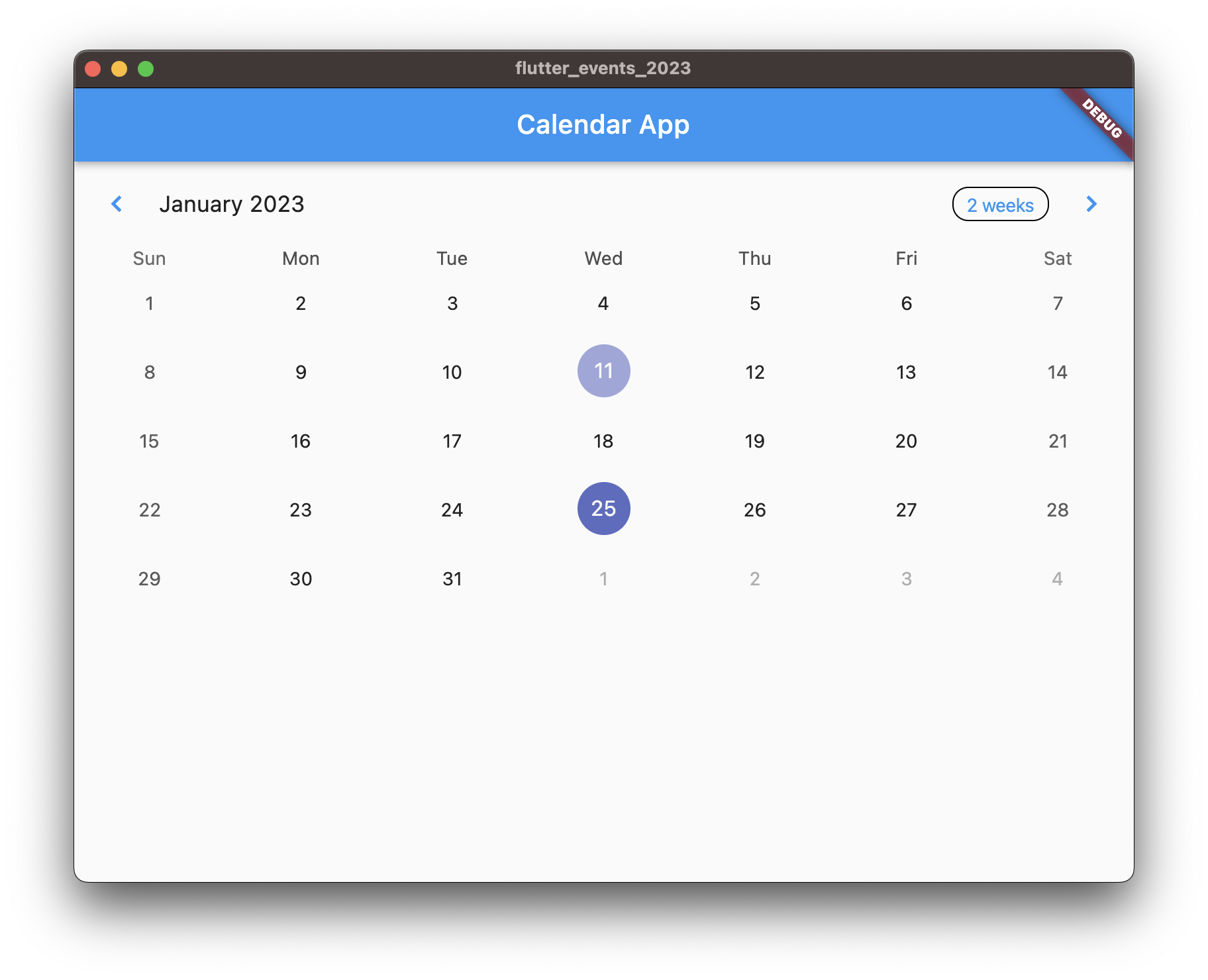
)Now run and you can select an available date in the calendar.

Customizing Calendar
Now that you know how to display a calendar as well as how to make it interactive. Let’s learn how to customize calendar so that it fits your applications design requirements. Apart from being easy to setup, table calendar is highly customizable. Let’s see what options are there to customize the look and fee of the calendar.
There are tons of customization options, which you can learn more about by going in to their API reference and looking at all the available properties. However, in this article we will talk about few that helps us customize.
Calendar Format
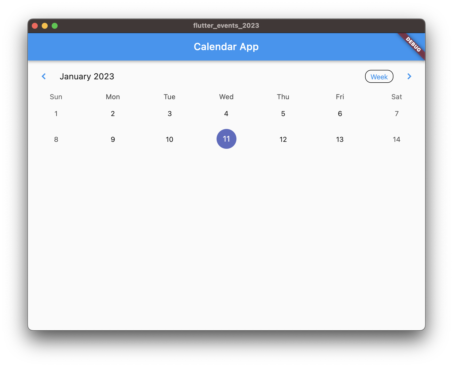
Right now the calendar displayed is of a month. There are two other formats available,
2 WeeksandWeek. In order to make the format fixed, you can providecalendarFormatproperty with one ofCalendarFormat.month,CalendarFormat.twoWeeks, orCalendarFormat.weekas the following.TableCalendar(
calendarFormat: CalendarFormat.week,
...
),This will set the calendar format to week, but will still display the format button. To completely disable the format button, update
availableCalendarFormatsas the following.TableCalendar(
availableCalendarFormats: const {CalendarFormat.week: 'week'},
...
),If you instead want to make the calendar format changing button work you need to provide
onFormatChangedproperty. For that, let’s define and initialize a calendar format property in our widget.late CalendarFormat _calendarFormat;
initState() {
...
_calendarFormat = CalendarFormat.month;
}Next, let’s update the table calendar as the following.
TableCalendar(
  calendarFormat: _calendarFormat,
  onFormatChanged: (format) {
    setState(() {
      _calendarFormat = format;
    });
  },
)
Now if you run and click the format button displayed in the header, the calendar format will change accordingly.

Calendar style provides basic customization abilities. It has lots of properties which you can find in the API reference. We will go through some of those here.
For example, you can provide a
weekendTextStyleproperty to style the weekend date text differently as the following.TableCalendar(
calendarStyle: const CalendarStyle(
weekendTextStyle: TextStyle(
color: Colors.red,
),
),
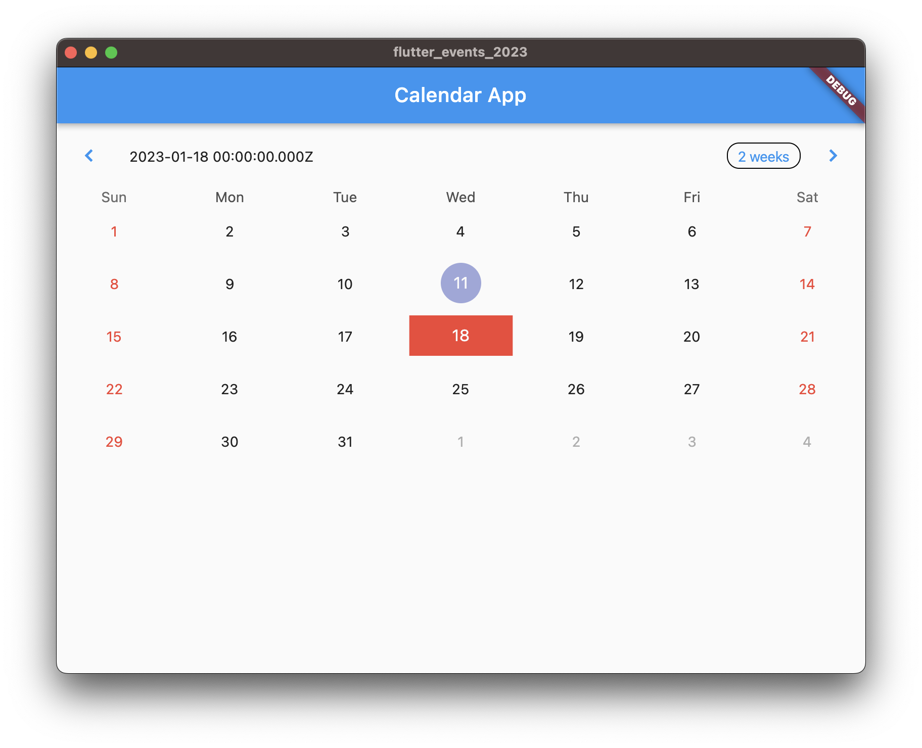
),This will make all weekend text to appear in red color. You can similarly provide
defaultTextStyleandholidayTextStyleto style holidays and default text to your liking. More over you can also provideselectedTextStyleto style the selected date differently.Apart from text style, you can also change the decoration of the date cell by providing corresponding decoration. You can provide
defaultDecoration,selectedDecoration,weekendDecoration, andholidayDecorationall accept aBoxDecorationinstance. For example to style the selected date differently we can do as the following.TableCalendar(
...
calendarStyle: const CalendarStyle(
...
selectedDecoration: BoxDecoration(
shape: BoxShape.rectangle,
color: Colors.red,
),
),
),Calendar builders provide more advance way to customize the calendar. It provides tons of options you can find in the API reference. Let’s talk about few here.
Let’s say we want to customize the header title, we can do that by providing the
headerTitleBuilderproperty as the following.TableCalendar(
...
calendarBuilders: CalendarBuilders(
headerTitleBuilder: (context, day) {
return Container(
padding: const EdgeInsets.all(8.0),
child: Text(day.toString()),
);
},
),
),Doing this will display the complete date in string instead of just showing Month and year as it was previously. You can use various other available properties of
CalendarBuildersto further customize the calendar to your liking.
Conclusion
You can find the code for this tutorial in the following repository.
https://github.com/lohanidamodar/flutter_events_2023
In this tutorial, we learned how to display a calendar in our Flutter application using table_calendar package. We also learned to make the calendar interactive by allowing user to select any date available in the calendar. Finally we learned to customize the calendar to better fit our application’s design. In the next article we will learn how to load and display events using calendar with event markers.